The S&P 500 Index
The S&P500 Index is a list of the 500 biggest public companies in the USA. It is based on market capitalisation. i.e. The current share price multiplied by the number of shares on issue determines a company’s market capitalisation and whether it makes the S&P500 list.
Small companies can move up the list of US companies and break into the S&P500 if company profits consistently increase over an extended period of time.
Increasing business profits or Earnings increases the share price.
The S&P500 represents the ‘cream of the crop’. These are big companies that have demonstrated consistent Earnings growth usually over decades. Companies that become unprofitable fall out of the S&P500 index. The S&P500 Index is therefore a stock selection method which identifies on an on going basis, the most profitable 500 public companies in the USA.
The S&P500 chart
Raw S&P500 price chart
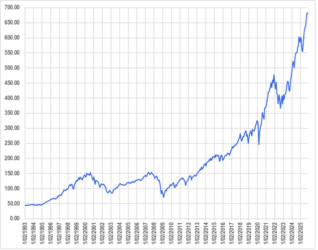
This shows an acceleration in price over time from compounding growth. Displaying as a % change is a more realistic way to display for readability and analysis.
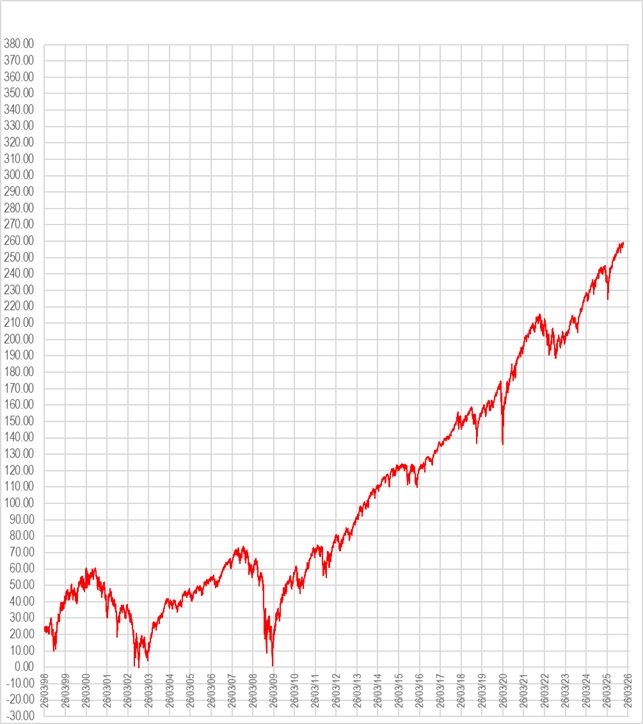
S&P500 % change chart
The significant features of the S&P500 price chart:
-Consistent long term Up trend
-Crashes every few years that may recover quickly (if just a news event) or continue as a Bear market for an extended period before rebounding and recovering all lost value.
S&P500 PE chart
Below is a chart of the PE for the S&P500 companies since 1960
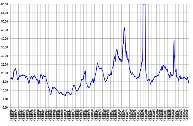
Since 1960, the PE has cycled up and down generally in a range between 15 and 20. The average or mean is around 17.
The S&P500 PE displays ‘mean reversion’ behaviour. i.e. it moves back to the mean or average of around 17.
Why does the S&P500 PE ‘revert to mean’
A PE of 17.0 equates to a ROI of 100/17 = 5.88%
This indicates that investors are generally looking for shares that generate a long term ROI of around 6%.
During a period of rising Earnings, share prices rise and the ‘herd’ become more and more bullish assuming share prices will continue to rise. “Irrational exuberance” is a term used by the Federal Reserve to describe this behaviour.
Inevitably a major negative economic or political news event will occur which will see stock prices crash. The sudden price fall is exacerbated mainly by preset stop loss orders that are activated by computer driven algos when S&P500 stop loss levels are hit. Prices fall in an escalating manner as stop loss orders are executed as Market Orders once hit. This means exit orders are filled at almost any price just to get out.
With the sudden crash, investors become very risk averse and nervous. They forget their bullish over exuberance and go back to basics which means look at Earnings.
Share prices will crash then bottom out to a share price around the long term PE range of 15 to 20.
PE chart since 1960
Since 1960, PE has cycled mainly in the range 15 to 20. Whenever the PE hits 20 it is only a matter of time before a crash occurs and PE reverts back to the mean of around 17.
To demonstrate S&P500 PE mean reversion
The table below shows the instances since 1960 where the PE has risen to over 20.0 then after an inevitable crash to revert to the mean range of 15 to 20.
Date Peak PE Reverts
hits 20.0 to PE
1961 24 16
1987 22 12
1992 26 15
2001 46 17
2008 60 14
2016 24 17
2020 38 16
Copyright
©2025 Ultima Investment Services
Disclaimer
The risk ratings and comments made in this report should not be regarded as
investment or trading advice. The Risk Ratings and comments made in this report do not indicate any trading method is profitable or that losses are not incurred. Seek professional advice before making any financial decisions based on the Risk Ratings or comments made in this report. Ultima Investment Services does not accept any liability for any losses or expenses incurred in applying the Risk Ratings or comments contained in this report.
